Free · from the video

The Slide Toolkit

Make your AI slides say something — and make yourself impossible to rattle.

Pretty is free now. A point of view — and the ability to defend it — is the job. This is the exact toolkit from the video, with the prompts you can copy.

From the video: Your AI Slides Look Gorgeous. Here's Why Executives Ignore Them.

The 60-second test

Read every title out loud and ask: “So what?”

Before you send a deck, run each title through one question. Your title is the one line they'll remember — spend it on a point, not a label.

Fails

The title only names the topic.

“Q3 Performance” · “Market Overview”

It's a thesis

The title answers “so what?”

“We're losing our most profitable segment — here's the fix”

Based on McKinsey “action titles” and Barbara Minto's Pyramid Principle.

Method 1

The 6-Lens Slide Makeover

Turn a generic, “beautiful” AI slide into a board-ready one-pager. AI makes pretty for free — and will confidently fabricate to look smart. So don't grade it on looks. Set a bar, and make it clear the bar.

The 6 lenses — every one must hit 9+/10:

  1. Audience — frame it for their decision, not for an analyst.
  2. One message — a single headline that is the takeaway (not “Q1 Sales”).
  3. Hierarchy — headline → the one chart that proves it → supporting detail. Mute the rest.
  4. Proof — every number labeled, sourced, time-stamped; asterisk anything that needs it.
  5. Polish — two colors + one accent, real whitespace, no default-Excel look.
  6. Action — end on what leadership should do / decide, not just “watch.”

The set-the-bar prompt

Paste after you attach your data + the AI's first “pretty” draft.

Copy & paste

You're my design-minded analyst. I'm presenting to senior executives. That last slide is "nice" — and nice is forgettable. Build a single, board-ready executive one-pager, then grade it against the bar below and keep improving until every lens is 9+/10: 1) AUDIENCE — frame for their decision. 2) ONE MESSAGE — a headline that IS the takeaway (find the real story; not "Q1 Sales"). 3) HIERARCHY — headline, then the one chart that proves it, then detail; mute the rest. 4) PROOF — every number labeled + sourced + dated; flag anything that needs an asterisk. 5) POLISH — two colors + one accent, whitespace, an elegant horizontal bar ranking, no default-Excel look. 6) ACTION — end on one line: what leadership should DECIDE next, not just "watch." Then self-critique against the six lenses, fix the weak spots, and tell me which pass you finished on.

Then run the critique loop

One line at a time — this is where it climbs.

Copy & paste

Be your harshest reviewer. The headline is still generic. What is the ONE non-obvious insight in this data? Lead with that, in plain language an exec would repeat.

Then inject the judgment only you have

The thing the numbers don't say.

Copy & paste

Judgment you can't get from the numbers: [your domain catch]. Add a footnoted asterisk so no exec misreads it, and make it the headline if it changes the story.

The model sets the floor (polish). You set the ceiling — the truth, the judgment, the call. If a prompt anyone has could've made your slide, it says nothing about you.

Method 2

Guided Preparation

A perfect slide you didn't think through, you can't defend. So flip AI from answer-giver to question-asker — and make yourself unrattleable.

Use Gemini → Tools → Guided Learning, or ChatGPT → Study Mode. Then:

Copy & paste

Don't help me. Quiz me. Play the most skeptical VP in the room — someone who hates this recommendation. Ask me the five hardest questions, one at a time, and don't accept a vague answer. After each, tell me if my answer would survive that room.

The question you can't answer cleanly is the gift — you found the hole in your case in private, not live in front of the board.

Build a brief that exposes itself

So every soft spot is labeled before anyone else finds it.

Copy & paste

Produce a board-ready decision brief recommending one option. You don't have my real numbers, so invent plausible ones — but tag every invented figure [ASSUMPTION]. Surface your own top 3 risks and flag the one number most likely to be wrong. It must survive a skeptical VP's first question — if you can predict it, answer it before they ask. Plain is fine; defensible beats pretty.

The real example

Before → after

Real public data — Car and Driver's “The 25 Bestselling Cars, Trucks & SUVs of 2026 (So Far)”. An illustrative competitive-analysis exercise — the kind you'd hand a junior analyst — but the method transfers to any team.
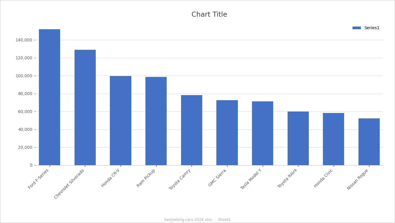
Before A default Excel chart titled 'Chart Title' with a 'Series1' legend
An Excel default — “Chart Title,” “Series1.” It names the data and says nothing.
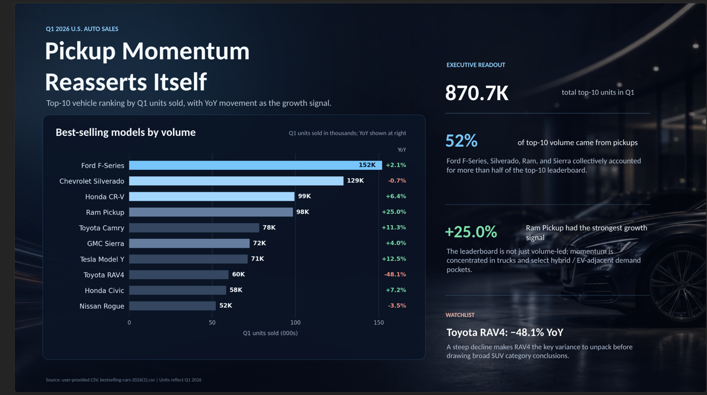
The trap A polished dark dashboard slide titled 'Pickup Momentum Reasserts Itself'
“Make it beautiful” gives a stunning slide that invents an insight not in the data (“EV-adjacent demand” — there's no powertrain column). Looks finished ≠ is finished.
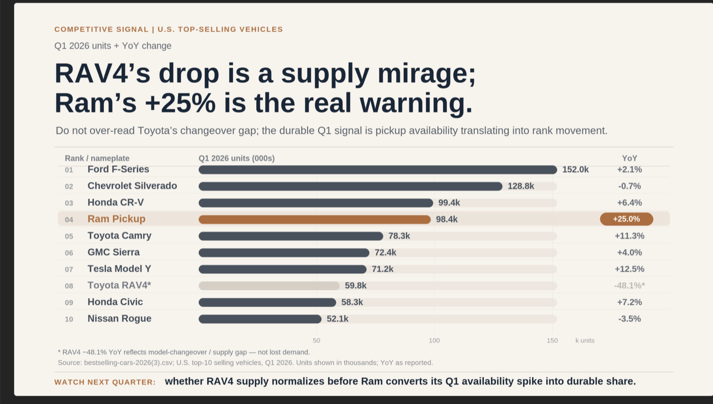
After A clean board-ready slide titled 'RAV4's drop is a supply mirage; Ram's +25% is the real warning'
6 lenses + your judgment: a real thesis (“RAV4's drop is a supply mirage; Ram's +25% is the real warning”), the caveat asterisked, and the action made explicit.

Source: Car and Driver — Bestselling Cars 2026

Get the Slide Toolkit

The prompts, the 6-lens checklist, the prep-drill.

Free. Drop your email and I'll send the pack — then a short note each time the next teardown drops.